Antique White Paint: How It Reads in Real Rooms (and the Whites It Beats)
Antique white causes more second-guessing than almost any other paint colour. People pick it because pure white felt cold on the chip, then panic when the first wall dries and looks… cream. That panic is the whole story of this colour: antique white is a warm off-white, not a bright white — and judged on those terms, it is one of the most forgiving colours you can put in a house. Here is how it behaves on a real wall.
Quick Facts
- Undertone: warm yellow, softened with a little gray (a greige lean)
- Reads as: soft ivory in balanced light, distinctly cream in warm light
- Best sheens: eggshell on walls, satin on cabinets, satin or semi-gloss on trim
- Test swatch: at least 2 ft × 2 ft, two full coats, checked morning and night
- Typical cost: about $35–$80 per gallon for mid-range to premium interior paint
- Coverage: roughly 350–400 sq ft per gallon per coat
What Antique White Actually Looks Like
Antique white sits one clear step below bright white: softer, warmer, and a little muted, the way a white cotton shirt looks after a few years next to a brand-new one. On a large wall it does not read as a “colour” the way beige or gray does, but it never gives you that crisp, gallery-white snap either. It gives you warmth without darkness — rooms feel settled rather than freshly painted.
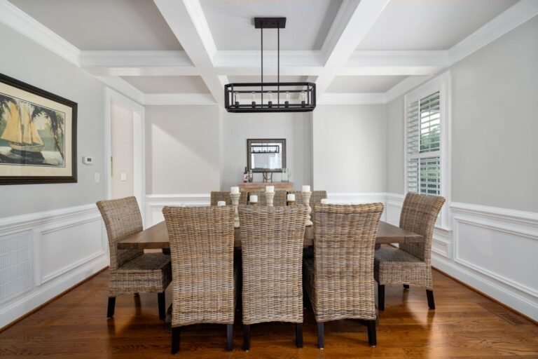
That muted quality is deliberate: antique white is built like an aged surface, so it sits comfortably next to warm wood floors, older trim, brass or black hardware, linen and wool. It flatters other materials instead of competing with them. If your taste runs to chrome and blue-gray stone, it will fight you; with oak floors, it looks like it was always there.
The Undertones Doing the Work
Every off-white is a negotiation between undertones, and antique white’s are simple: a yellow base, cut with enough gray to keep it from going buttery. That gray component — the greige lean — is what separates it from a straight cream. Cream is yellow with the volume up; antique white is yellow with the volume down.
Two consequences follow. First, antique white almost never flashes pink or blue in odd light, unlike many greige and “warm white” shades that swing lavender at dusk. Second, the yellow base amplifies whatever warmth is already in the room — warm wood, warm bulbs, afternoon sun. In a room that already runs hot, it can tip from “soft ivory” into “definitely cream,” and you want to know that before the second coat.
Light Direction Changes the Answer
The same gallon reads like three different colours depending on which way the windows face:
- North-facing rooms get cool, bluish, indirect light all day. This is antique white’s best room: the warm base cancels the blue cast and the wall reads as a balanced, soft white. Pure white, by contrast, often looks gray and dingy in north light.
- South-facing rooms get warm, direct sun most of the day. Antique white warms up further and reads its creamiest here. If you hate any hint of yellow, test very carefully.
- East- and west-facing rooms swing during the day: east rooms are golden in the morning and flatter by afternoon; west rooms do the reverse, with intense warm light late in the day. Check east rooms at both ends of the day, and west rooms in the late afternoon.
Bulbs matter as much as windows. Under 2700K warm bulbs, antique white leans cream; under neutral 3000–3500K bulbs, it reads closest to the chip; under 5000K daylight bulbs, the yellow flattens and the gray lean shows more. Settle your bulb temperature before judging the paint.
Antique White vs. Pure White vs. Vintage White
These three get confused constantly, and they are not interchangeable:
| Antique white | Pure white | Vintage white | |
|---|---|---|---|
| Overall tone | Warm, muted off-white | Bright, clean, near-neutral | Soft white with a faded, aged feel |
| Undertone | Yellow with a gray/greige cut | Minimal; often a trace of blue or black pigment | Yellow plus a hint of tan or pink |
| Feels like | Settled, traditional, forgiving | Sharp, modern, high-contrast | Gentle, cottage, slightly nostalgic |
| Best for | Whole rooms, older homes, warm materials | Trim contrast, modern spaces, ceilings | Furniture, cabinets, small accents |
| Watch out for | Going too creamy in south light | Looking cold or blue in north light | Looking dingy next to anything bright |
In short: pure white is a contrast colour, antique white is a room colour, vintage white is an accent colour — and a touch darker than antique white, so it is risky across four walls.
Where to Use It: Walls, Trim, and Cabinets
Walls are its home turf. One reliable approach is antique white on walls and trim alike, separated only by sheen — eggshell on the wall, satin or semi-gloss on the trim. The sheen change gives you all the definition you need, especially on detailed trim and panel moulding, where shadow lines do the decorating.
Cabinets are the second-best use. Antique white cabinetry reads warm and furniture-like rather than stark, and pairs well with black hardware — strong contrast, but not harsh. Use satin in a paint line made for cabinets and trim; expect the colour to look slightly richer than on walls, because doors catch light from more angles.
Ceilings need care: antique white above brighter walls makes the ceiling look yellowed. If the walls match, a matching ceiling feels calm; otherwise keep the ceiling a cleaner white.
Pick the Sheen by Surface, Not by Habit
Sheen changes how the colour reads: the glossier the finish, the deeper antique white appears, because the surface reflects more light back at you.
- Flat/matte: hides wall flaws best, but marks easily and can look chalky. Best for ceilings and low-traffic rooms.
- Eggshell: the default for walls. Slight glow, wipes clean, shows the colour honestly.
- Satin: right for cabinets, doors, and bathroom walls. On large living-room walls it can look shiny and show roller marks.
- Semi-gloss: reserve for trim. The sheen jump against eggshell walls creates the classic two-tone effect from one colour.
How to Test It Properly
Off-whites lie on small chips, so test like this:
- Paint big. At least a 2 ft × 2 ft patch, or two coats on a primed board you can carry around the room.
- Always two coats. One coat over your old colour is a blend of two colours, not the colour you are buying — a thin first coat is why people think antique white “turned pink.”
- Check it three times: morning, midday, and at night under your actual bulbs. The night check is the one most people skip — and the one most evenings are spent in.
- Test against the fixed stuff: hold the board against your flooring, trim, and largest piece of furniture, not the paint-store wall.
- Live with it for a full day if the room faces south or west, where the colour swings most.
Common Mistakes
- Choosing from the chip alone. Off-whites compress on a 2-inch chip; the undertone only shows at scale.
- Pairing it with blue-white trim. A bright, cool white trim makes antique white walls look yellow and dirty by comparison. Match the trim to the wall colour in a higher sheen, or pick a trim white that is warm and only slightly brighter.
- Skipping primer over dark walls. Antique white hides less than mid-tone colours. Over a dark old colour, prime first, then two coats — or the tone drags muddy.
- Judging wet paint. Antique white dries noticeably less yellow than it looks in the can. Wait for a full dry, ideally overnight.
FAQ
Is antique white the same as cream?
No, though they are cousins. Cream is deeper and more yellow; antique white is lighter, with gray mixed in to quiet the yellow. Cream announces itself as a colour, while antique white usually reads as a warm, soft white.
Will antique white make my room look yellow?
It can, in the wrong light. South- and west-facing rooms with warm bulbs stack warmth on warmth, and the yellow base shows. In north-facing rooms it rarely looks yellow at all. The big two-coat swatch settles it — check it when you use the room most.
Can I use antique white on kitchen cabinets?
Yes — it is one of its best uses. Choose satin in a paint line made for cabinets and trim, prep and prime properly, and expect a warm, furniture-like result rather than a bright white-kitchen look. It pairs well with black or aged-brass hardware.
What colour trim goes with antique white walls?
The safest answer is antique white itself, one sheen up: semi-gloss trim against eggshell walls. For separate colours, pick a warm white just slightly brighter than the wall — avoid cool, blue-leaning whites, which make walls look dingy.
How much does antique white paint cost?
The price is in the paint line, not the tint. Typical ranges at US home centers run about $35–$50 per gallon for mid-range interior paint and $60–$80 for premium lines, covering roughly 350–400 sq ft per gallon per coat. A standard bedroom takes about two gallons for two coats.
The Bottom Line
Antique white is not a compromise between white and beige; it is a deliberate choice — warm, muted, and kind to older materials and cool light. It beats pure white in north-facing rooms and traditional houses, and loses in hot, sunny rooms if you are yellow-averse. Test it big, twice-coated, and at night: if it passes those three checks, it is very hard to regret.